Case Study: Coravin Pivot and Timeless
Graphic Design | Packaging | Print
01. Project Overview
My goal was to update and create packaging across two product lines: Coravin Pivot and Coravin Timeless. I aimed to simplify and modernize the design to refresh the out-of-box experience for both customers and partners.
02. Contributions
As the lead designer on this project, I aimed to create a consistent and modern visual across the two product lines. By collaborating with the marketing, engineering, and EU/APAC teams, I created the inner and outer packaging for 3 products, as well as translated videos for our EU/APAC regions to make Coravin accessible to a global audience.
03. Challenges
My three main challenges involved:
Innovation while maintaining integrity
Consistency with both visuals and collaboration
Performance metrics and expectations
04. Solution
To meet brand and business objectives, I simplified the existing design to produce a more digestible visual. I was particularly inspired by the KitchenAid packaging redesign, and focused on highlighting the product features. I also tied in the background colors across the products to show a gradual progression.
05. Results
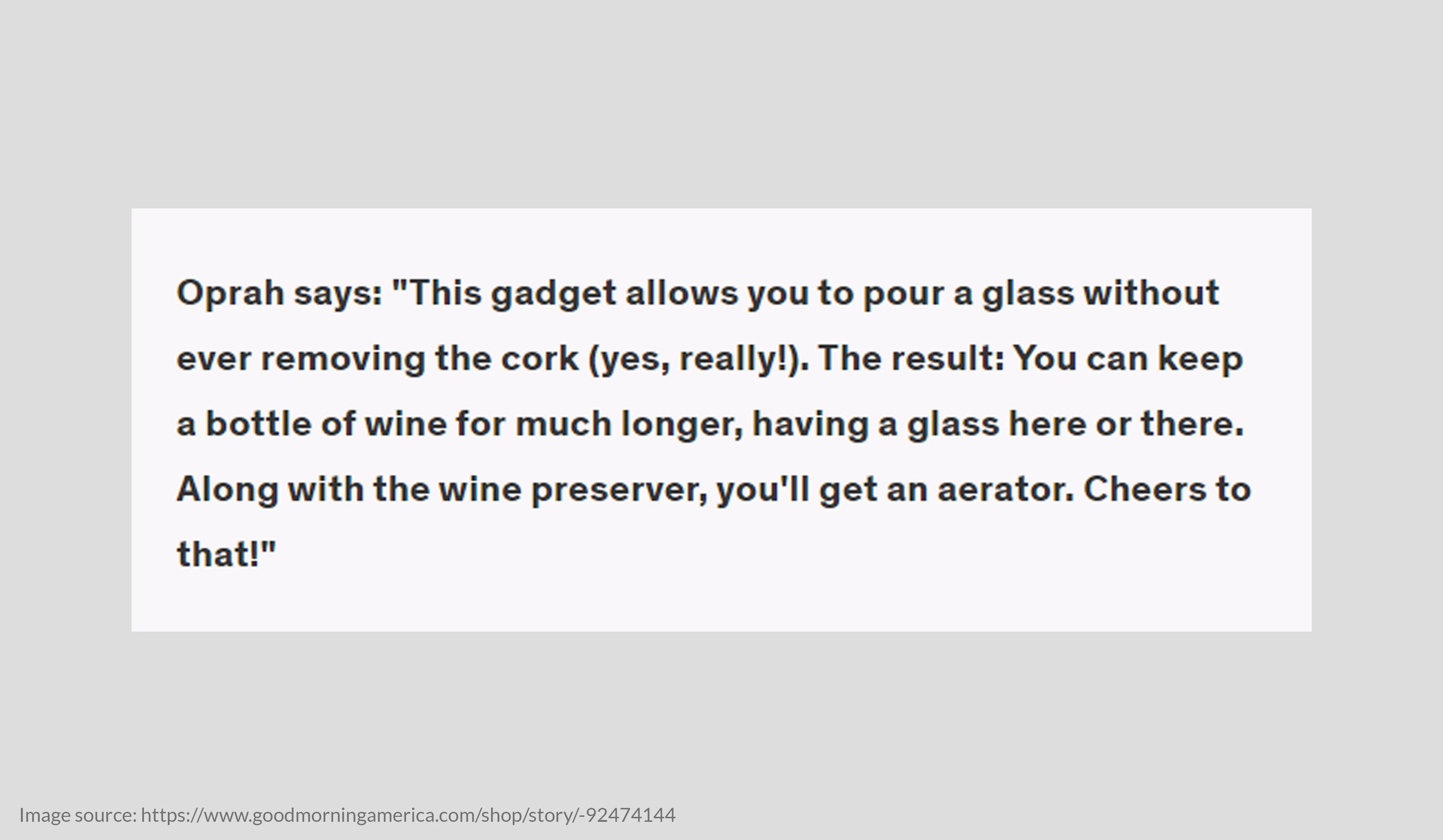
The packaging rebrand was met with positive feedback from customers and partners. The addition of QR codes led to an increase in website traffic and product exposure, increasing the potential for a consistent customer base. Coravin also made it on the 2022 Oprah’s Favorite Things list!


